thinkit creative

tell bolder stories

  • ABOUT
  • CONSULTING
  • CONTACT
You are here: Home / Archives for presentation

How to create a presentation that doesn’t suck

By Patrick Gant

presentation_image

Most presentations suck.

They go on too long. The speaker’s compelling idea gets buried in a lot of noise. They make it feel like work for the audience to follow along. And we quickly forget what was said.

And yet some presentations don’t suck. Instead, they persuade. Some do this despite the fact that they’re long and packed with details. We remember what was said.

So why does that happen?

As someone who holds a lot of workshops and teaches what I know, I spend time studying what works well, based on the research and field work of people who are masters at their craft.

There are ten take-aways I’ve learned that you can apply to any presentation to make it connect better wth your audience. 

All great stories are about structure 

Even when presenting an idea, you are telling a story. Writer Steven Pressfield says it best: “the arc of the hero is a structure that is at the heart of every story.” That means every story we tell needs to define a problem, show a solution and then show what we learn by applying that solution. As a speechwriter, that’s at the core of every keynote I work on. It applies just as much to how you present your work. In your introduction, show your audience what they’re going to see in your talk and refer back to it as you move from point to point. If you don’t have structure, your presentation is going to suck. 

Know your goals

The goal is not to make people know things. You can’t make people do anything. All you can do is persuade. Harvard’s Stephen Kosslyn, a well known cognitive neuroscientist, wrote what I consider an essential speaker’s guide on presentation clarity. He points out every presentation has three goals: earn an audience’s attention, keep that attention, and make it easy for people to both understand and remember what you talked about. If you miss any of these goals, your presentation will suck.

Slides don’t tell your story: you do

Your slides are designed to do two things: help your audience situate themselves in your story, and hold their attention. They are not your speaking notes or your TelePrompTer. In fact, they’re not for you at all. They are for your audience. If you find yourself reading from your slides, your presentation will suck.

Busy slides defeat your purpose 

Busy slides either get read at the expense of listening or they get ignored. Here’s why. People can read faster than they can listen. So if you cram all your facts on your slides (and if it’s legible), your audience will read them. And they won’t listen to you while they do this, which raises questions why they’re there in the first place. Don’t do that. Treat each slide as the bare minimum of the point you’re driving at in that segment of your talk. Busy slides are the Batman signal of a presentation that’s going to suck.

Bullets kill attention

This point is a matter of opinion, but it’s an informed one based on what I see that works in the marketplace. Don’t use bulleted lists on slides. Bullets are used in long reports and in articles to compress ideas to keep a reader reading. But presentations aren’t documents. They are talks designed to hold your audience’s attention while you communicate persuasively. Even if you do decide to use bullets, heed the advice of Garr Reynolds in Presentation Zen: “people will tire quickly…if several slides of bullets lists are shown, so use them with caution.”

Pictures do more than words

Reynolds’s book on presentation design has a terrific section that illustrates the power of visuals to complement your message. He also shows how easy it is to undermine that power by trying to convey too much information on a slide by adding text and data. He describes it as a Signal to Noise ratio. The harder it is for your audience to understand the difference between one data point and another, the greater the likelihood your presentation is going to suck.

Don’t report numbers: show meaning

Behavioural science tells us there are two kinds of learners: visual-driven and data-driven ones. Even the latter group get frustrated and bored if all you do it use the “spray and pray” approach to reporting on a series of complicated facts. Stop making it feel like work to understand the point you are driving at. If you are showing a bar chart with five data points on it, your focus should not be on reporting each of those five points. That’s self evident. Show the relationship between these numbers. Is there a 38% jump in activity from point#1 to point#5? That’s your story. 

Understand cognitive load

It’s not that people have short attention spans. It’s that time is limited and people are busy. Presentations communicate a lot of information in a compressed period. And generations of cognitive research reaffirm that audiences have far less capacity to retain and makes sense of messages than we give them credit for. You’ve had weeks and months and even years to think through what you want to talk about. They have maybe 20 minutes. Even less if they’re tuning you out because your presentation is sucking.

You is a magic word

I talk about this point often in the context of writing for the web and other copywriting. It matters just as much in presentations. If you write a presentation that talks to an audience like they are a mass of people, your presentation will suck. Talk to them as individuals. It is a profound need of all human beings to feel seen and heard. The less likely it is that each audience member feels you are saying “I see you,” the more likely your presentation is going to suck.

Polish your closing

Admit it: most of us who write a presentation devote 98% of our time working on having a strong opening hook and making sense of our most salient points. Your conclusion tends to be an afterthought. Usually because you’ve run out of time. I like how Garr Reynolds explains this. He points out that Japanese culture speaks of “Hara Hachi Bu,” which is to eat until 80% full. I try to adopt that principle when writing a conclusion: polished and filling, but not too much.

Rethinking the professional speaker’s one-sheet

By Patrick Gant

Where are you going

Photo: Gawker Media

Now that so much marketing is digital, the professional speaker’s one-sheet is looking more and more like an anachronism.

It was a time-honoured tool for generations, consisting of a headshot photo, a brief bio and an overview of your area of specialty.

It was a speaker’s key marketing tool. It got the job done.

The traditional one-sheet was designed based on three assumptions: it would be almost exclusively used as a paper-based product, you could reuse that product for a mass audience, and it was an acceptable, unidimensional substitute for introducing yourself personally to someone.

Let’s challenge those assumptions.

So much about the way we market has changed. Today, it’s more relationship-based, far, far less dependent on paper, and people learn a lot more about you faster than ever.

On top of all that, there are tools out there that just everyone has to quickly (and regularly) create a more engaging, personal introduction with your audience.

I’m not saying you should blow-up your one-sheet. Far from it.

The copywriting sales mastery that used to go into that product is as vital as ever. And if you don’t invest in developing a professional product that’s engineered to sell, you’re leaving money on the table.

But you do have to stop thinking about it as a static, single sheet printed on paper.

If you are a professional speaker or presenter, this is still one of your top marketing products. It just has to catch-up with the way people make decisions today. That’s at the root of professional speaker marketing (and it’s why it’s a fast-growing part of our business here at thinkit creative).

Think of your product—your bio, photos, benefits statement, testimonials and areas of specialization—as modules. These are components that you can rearrange and tweak to suit the interests of a specific speaking engagement. Put them all in a folder and generate digital products on the fly. There are pros who can help you with this.

Don’t stop there. Consider shooting a short video and posting it to a special webpage on your site…just for that upcoming speaking event. Link it to you what you send. Integrate what you have to say with your other material on your website, LinkedIn and Twitter profiles (among other sources).

Static, mass-produced products are out. Personalized, interconnected and flexible digital products are in.

How you can improve your PowerPoint presentation today

By Patrick Gant

Slides1. Your Powerpoint or other slideware material shouldn’t compete with your presentation. Sounds obvious, right? But anyone who has had to squint to read all the copy on crammed onto dozens of slides in a presentation knows this mistake is still a common one.

2. When sharing data-based information with your audience, don’t just report on numbers. Explain the meaning behind numbers. Infographics and tastefully designed charts make a major impression and enlighten” in seconds.

3. Don’t cram your logo onto every slide. Ignore those who tell you that this age-old practice is all part of branding. It’s not. In a presentation, it’s just clutter. You’re on stage speaking directly to people. They know who you are already. What they don’t know yet is whether what you have to say is useful to them. That should be your #1 point of focus.

4. White space is your friend. Your audience will appreciate it more if you have more slides with less content on each page than just a few that are jam-packed and hard to read.

5. Always remember one of thinkit creative’s top rules about writing that sells: people are busy. You have less time than you think to attract and sustain the attention of your audience. So invest wisely in fine-tuning the design that drives your slides as well as the content that connects the value of who you are what you do with the needs of the people listening to what you have to say.

The year in rhetoric & presentations

By Patrick Gant

speechwriter bubblesThis post by Aaron Wherry in Maclean’s is a must-read for anyone interested in the best that political speech-making skills offered in this fine town. I agree wholeheartedly with his praise for Robert Fowler’s impassioned speech, but also draw your attention to Wherry’s observation:

We have may long ago lost our patience for hours-long addresses, but there remains a certain craving for the sight and sound of a politician speaking resoundingly, passionately and at length.

Going beyond the confines of the Queensway however, my money on the finest political speech of the year was this one by Gordon Brown. He gets bonus points for quoting the classics in his conclusion…

When Cicero spoke to crowds in ancient Rome people turned to each other after hearing the speech and said “great speech.” But when Demosthenes spoke to the crowds in ancient Greece and people turned to each other they said, “let’s march!”

But let’s not limit this best-of list to political speechmaking.

Two of the finest presentations in 2010 were TED Talks—neither relied heavily on powerpoint slides, but rather on thoughtful rhetoric and a speaker who believes passionately in a cause.

The first presentation was by Sir Ken Robinson, arguing for a revolution in education…

We have to go from what is essentially an industrial model of education, a manufacturing model, which is based on linearity and conformity and batching people. We have to move to a model that is based more on principles of agriculture.

The second noteworthy presentation was by game designer Jane McGonigal, making a persuasive case for how gaming can change the world, starting with this arresting point…

Right now we spend three billion hours a week playing online games. Some of you might be thinking, “That’s a lot of time to spend playing games.” Maybe too much time, considering how many urgent problems we have to solve in the real world. But actually, according to my research, at The Institute For The Future, it’s actually the opposite is true. Three billion hours a week is not nearly enough game play to solve the world’s most urgent problems.

And….there’s one more thing. I’d be remiss if I didn’t give a tip of my hat to Jesse Desjardins‘ award-winning “You Suck At PowerPoint,” doing his part for making the world a better place, free of snoozeworthy slideware presentations. (Added hyperlink for those of you accessing this on iOS devices)

YOU SUCK AT POWERPOINT!

View more presentations from @JESSEDEE.

Business apps for iPad: a writer’s take

By Patrick Gant

At the consumer level, it doesn’t take very long for the iPad to win people over. It’s easy to see its appeal for personal use (and I’m pretty sure I don’t need to rehash all the reasons why here).

But what about for business? That’s an area that’s still being explored in terms of finding ROI. So let me share what I know about that.

I’ve been using my iPad professionally since its US launch back in April, so I’ve had some time to really think about how I can best use this device. I’ve also spent a fair amount of time trying out a wide assortment of apps made exclusively for this iOS platform. Some apps surfaced with great promise and fanfare. Others have had to work hard to earn their keep.

So here’s my take as a professional writer on the apps that I consider must-haves:

Keynote

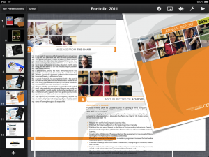
To be clear, the iOS version of Apple’s slideware application is not a complete substitute for its much more powerful desktop counterpart. This version is considerably scaled-down. But that’s okay, because as I see it, Keynote for iPad works best for one-on-one presentations versus addressing large groups.

When I meet clients and prospects face to face, I like to share with them some samples of my work. I used to do this by maintaining a large portfolio book—something that’s not always practical for every meeting. With Keynote on my iPad, I create customized presentations with writing samples that the reader can flip through and zoom in as needed. It’s really handy…and it is by far my most effective presenting tool for generating new business.

Instapaper
I’ve blogged about this service before and I’m glad to do so again. I do a lot of research in my line of work, plus I’m a consummate reader. It can get tricky to try and keep track of everything I want to read, particularly when I’m pressed for time. With Instapaper, I just click “read later,” and it saves the link without all the hassles of bookmarks. Later on, with Instapaper’s iPad app, I can read those saved articles at my leisure, including in “dark mode” (black background against white text), which I find is much easier on the eyes. The good stuff gets added to my Yojimbo database and I toss out the rest.

Yojimbo
Another long-time favourite tool of mine on the desktop. The developers just launched the iPad version a little more than a month ago, and in that short period of time it’s proven its worth to have a place on my springboard. It’s the simplest way that I know of to manage texts, PDFs and images (among other things) on multiple devices. At this stage, the iPad version doesn’t yet allow for generating new documents (the developers promise that’s coming soon). For now, it suits me fine as my one-stop reference for white papers, academic articles, favourite stories, and quotes.

IA Writer

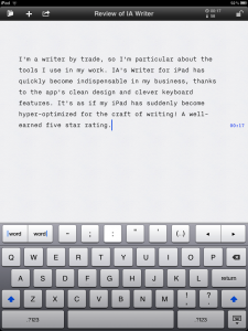
There are two processes to my work as a writer. First, I generate raw ideas and write them down quickly. No editing on the fly. Just text in its most bare-bones form. This is an important part of my work and so I don’t want any distractions. On the desktop, I use either Yojimbo or TextEdit for that task. On the iPad, there’s Pages, which does have its place at the formatting stage (which is the second process in my work). But I want something that simply does text.

Enter IA’s Writer for iPad. Minimalist features. Just start writing. The app looks after saving your work and if you have Dropbox, it syncs your work to your shared folder so you can access your work later from other devices. But the best part of all is its enhanced keyboard. It adds just the right number of added functions that are otherwise either missing or hard to get to with iPad’s standard keyboard. Key among these: move forward/backward by word, apostrophes, quotation marks and hyphens.

Pages
As with its counterpart. Keynote, Pages for iPad is a scaled down version of the desktop word processor. It does a competent job at fine-tuning and formatting simpler documents, but I’d advise against trying to use this for performing any kind of detailed edit of a document. In my own workflow, it’s been largely eclipsed by IA Writer

TED
As a writer who is also speaker and presenter, lifelong learning is part of my craft. TED Talks are a great learning tool both in terms of having great content and powerful presentations. I much prefer watching TED Talk videos on my iPad because it feels more personal. It also forces me to pay attention more carefully than on my desktop, where there are always distractions competing for my attention.

Money
Jumsoft’s Money app makes the cut as the easiest way I’ve found to track expenses. And it does so without me having to deal with a lot of the needless nuisances that tend to plague apps in this category. To my knowledge, it’s also the only one that syncs entries between iOS devices and Mac desktops.

Penultimate

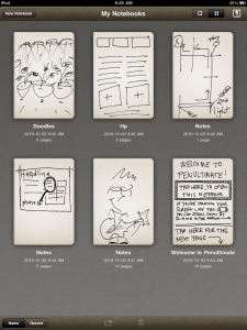
Having tried several sketching and handwriting apps, I settled on Penultimate because—like so many others on this list—it concentrates on doing one thing really, really well. In this case, it’s the ability to visualize my ideas quickly.

For me, Penultimate is the one app among so many that are out that that has the closest feel to working with a felt-tipped pen, making it a lot easier to start working with your fingertip on the screen without too much hassle. In meetings where I’m talking about an ad concept, for instance, I can sketch a rough idea quickly and email it to others if necessary. It’s also handy for writing out directions or anything else that I’d otherwise me sketching on paper.

Flipboard
Plenty of praise here for this app, which lives up to its claim as “your personal magazine.” True, Flipboard’s main purpose is to transform columns of social media into something that has the look and feel of a magazine. And it does this rather well. It also excels where most newspaper apps fail, it presents news articles in a way that encourages you to read more, but without resorting to the everything and the kitchen sink approach that tends to clutter so many apps (and I’m looking at you, Globe and Mail).

Honourable mentions…

Jumbo Calculator
It’s a mystery why Apple opted against porting to iPad their Calculator app for iPhone, but Jumbo closes that gap with a simple app with big buttons.

CBC Radio
Not directly a business tool, but sure comes in handy for checking the news when I’m on the go. Bonus points for sporting an intuitive design.

Kobo Reader
Better selection and better prices than iBooks, and none of the ridiculous kludginess of Amazon’s Kindle app.

WordPress
I use this to post to this blog and revise my website from anywhere my business takes me. It’s simple and straightforward. And free. Which is rather nice.

Mindnode
This is my go-to app for brainstorming and mapping out my thinking when confronted with a problem. It’s simple with just the bare elements of what I need in a mindmapping application. I just wish it would support Dropbox syncing.

Yoga with Jamine
Taking a health break is an important part of any healthy enterprise. A few minutes of yoga can really hit the spot on a stressful day. I find this Yoga app so much more useful on the iPad…the videos are larger and easier to follow versus on the iPhone.

Twitteriffic
Easy to use twitter app, but doesn’t get updated as often as it should by the developer. Could go from being good to great with a little more TLC.

Kayak HD
Best of the breed for booking flights and hotels online.

Next Page »

Free articles on creativity and marketing

Speechwriting Mastery Workshop

Our privacy policy and technical notes

Testimonials + Clients

About Patrick Gant

Follow us on LinkedIn

LinkedIn icon

Tell bolder stories, made for the digital marketplace.

Ottawa - Toronto - NYC - SFO - Vancouver